Guardian Layer
A browser extension that protects older adults from scam emails, without asking them to learn anything new.
Six real installs
Running in real Gmail accounts, against real incoming email.
Figuring out how it reaches the right people
The people who need it won’t search for it. Now designing for the younger generation who’d install it for someone they love.

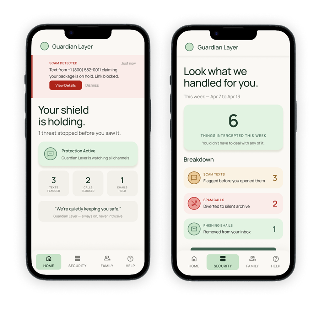
A phone app can’t read texts or monitor calls on iOS, the permissions ask is heavy, and the backend was bigger than one designer could ship.
Same protection, different form. A Gmail extension that flags scams where the threat lives. A smaller trust ask, and nothing new for the user to learn.
Tested how users react to the warnings.
Will a pre-view warning actually change behavior?
Yes, they read the warning first and decided to not act upon the email.
Tested how users react to the false warnings.
What happens to trust when the tool is wrong?
One type of group lost the trust while the other believed it was right.
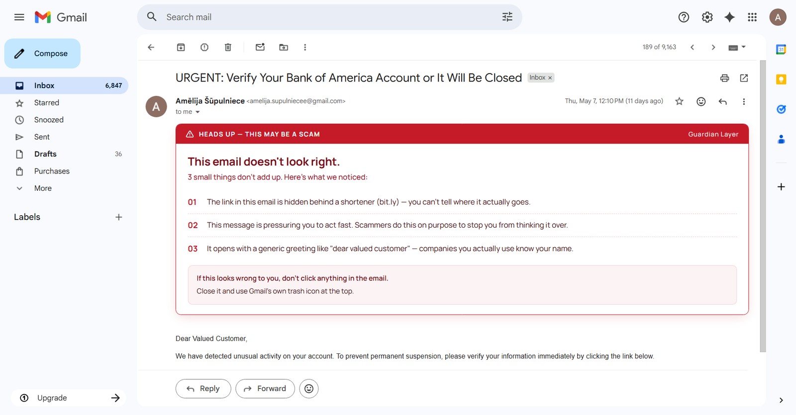
One warning. Two readings.
View live onboardingIt names what's wrong, not just that something is wrong. Three specific reasons.
It tells the user what to do. Ends with a clear action.
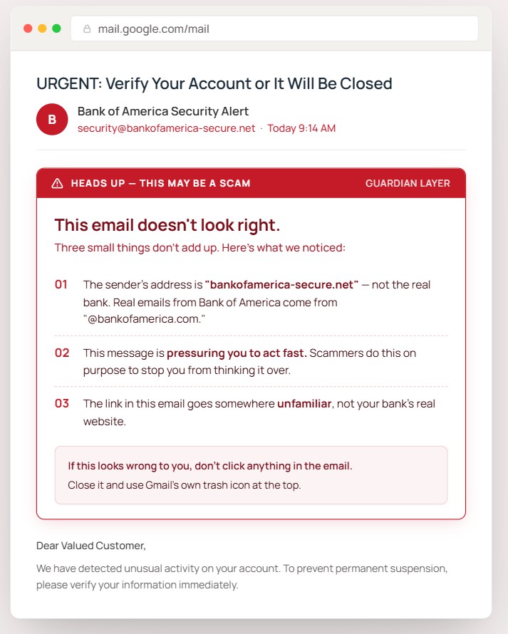
It speaks the user's language. No "phishing," "spoofed domain," or "malicious URL."
It explains how Guardian Layer reads and evaluates emails.
The false positive policy is shown upfront, including how the system handles its own mistakes.
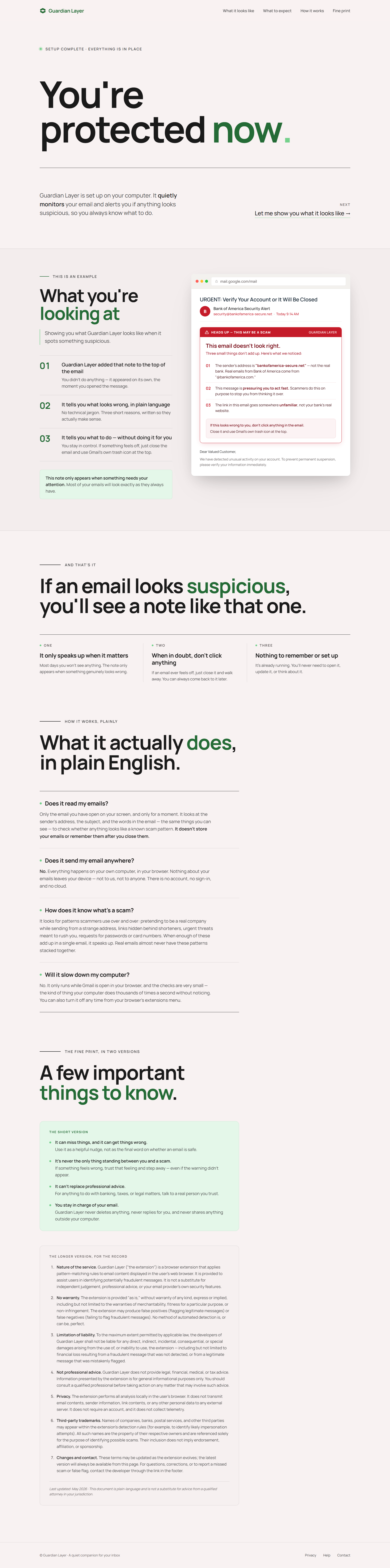
It confirms that the protection has been set up.
It shows the product instead of describing it.
The privacy model is stated clearly: what gets read, what gets stored, and what stays untouched.
This started as a project about payment apps. It became a project about protecting people who don’t know they need it.
View full case study